How to Design Click-worthy Pinterest Content
Would it surprise you if I told you that Pinterest is the biggest driver of social traffic to the studio’s site? It's true! And it's not by pure luck or coincidence.
For every blog post, client case study and new product that I add to the site, I always have Pinterest at the forefront of my mind when putting together visual content. Why? Because eye-catching Pinterest content leads to more re-pins, which leads to more website traffic.
Today I want to share three of my top-performing pins and break down exactly why these pins drove visitors to my site in droves. Ready for your social media content to get a little more pin-teresting?
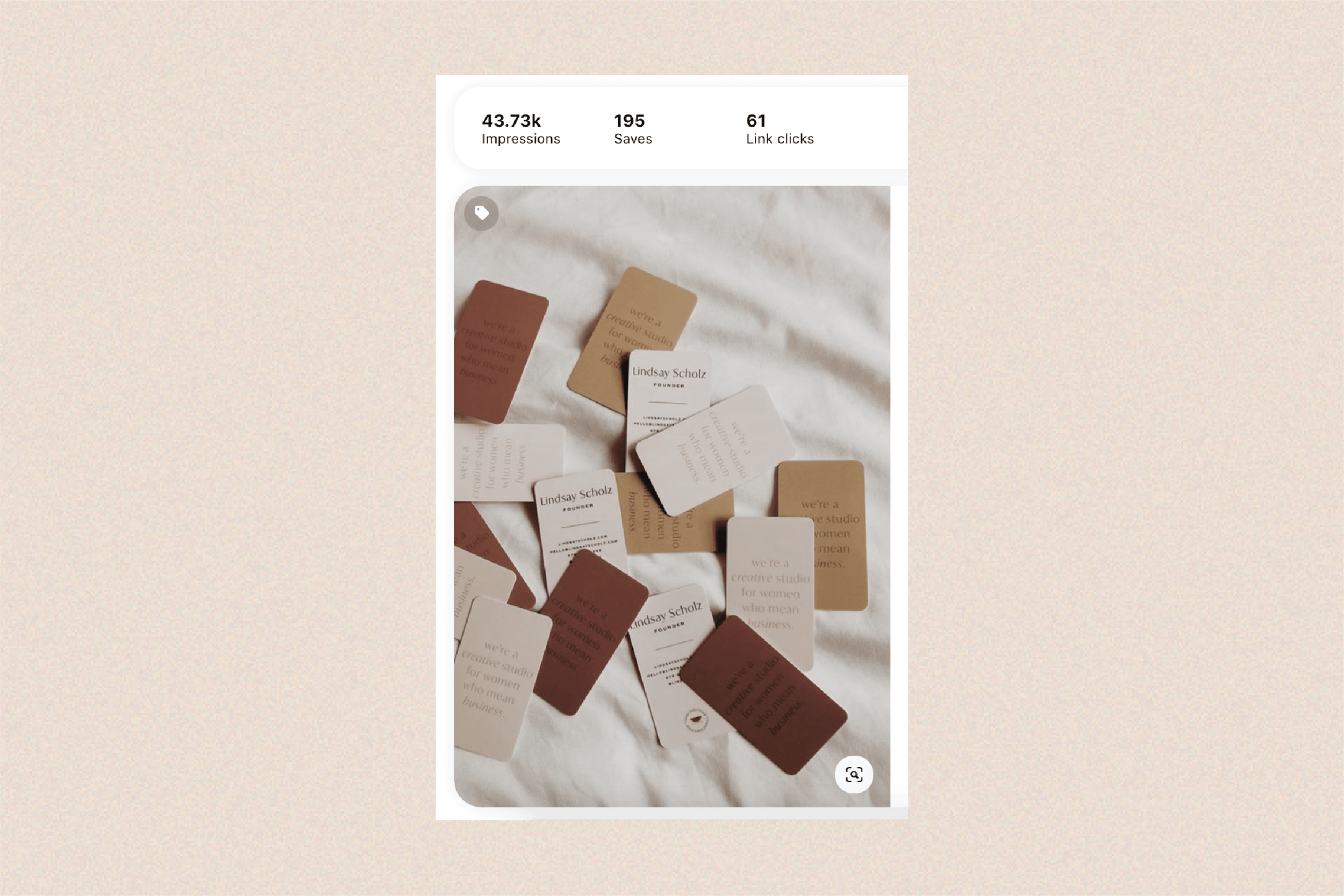
This pin is the top-performing pin for all of my Pinterest content, which drives interested Pinterest users to my homepage. Although most pins of our studio’s work perform generally well, this pin has performed exceptionally well because it showcases something expected (business cards) in a new way (multicolor variants).
Key takeaways:
• Use textures and layers to make work sample pins
• Incorporate natural light when you can when shoot eyecatching work for social and Pinterest
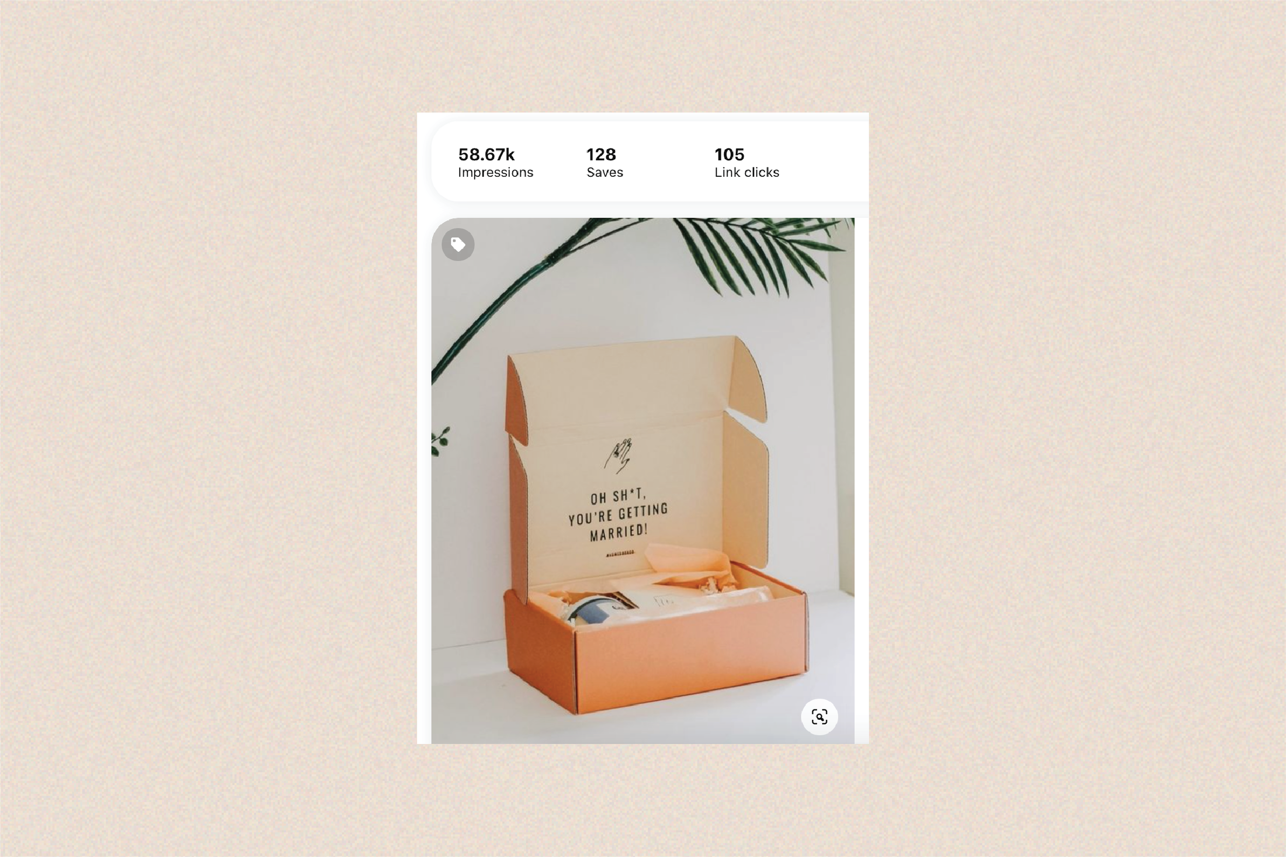
When scrolling through the Pinterest feed, it’s important to use color strategically to capture the attention of your audience. This work sample pin for Vowed Box Co. does exactly that – it incorporates a bright, unique color along with some outside-of-the-box brand messaging to entice the viewer to click to learn more.
Key takeaways:
• Use color where applicable to grab attention in the Pinterest feed while sharing work samples
• Entice users to learn more on your site by not giving away 100% of the details about the project on Pinterest
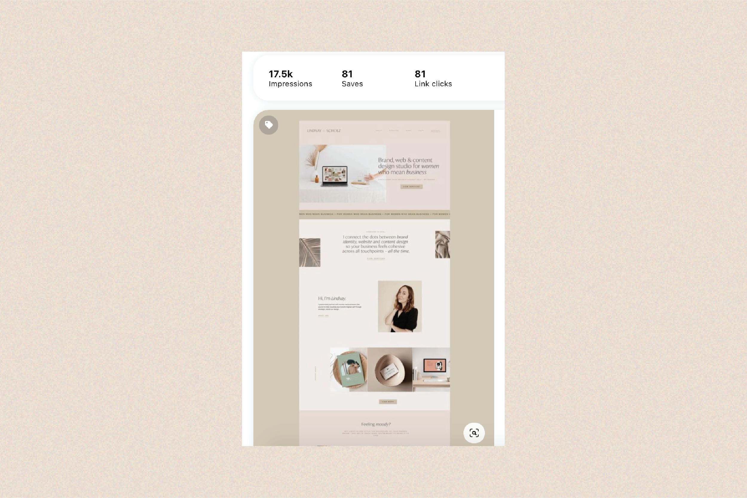
This is probably the most simple tactic when it comes to Pinterest content, but it sure does work for brand and web designers – full-page screenshots! With one click, I was able to put together this simple-yet-effective pin of my own website's homepage, which has generated notable traffic back to my site. Just launched a brand-new website for a client? Don't forget to grab a full-page screenshot (using this Google Chrome browser extension!) and pin it. More often than not, you'll be amazed with the results.
Key takeaways:
• This tactic works best with long, vertical webpages
• Include an engaging caption with keywords to boost visibility of full-page screenshot pins
It’s time to get growing.
Our collection of email templates and Pinterest keywords are designed with creative visionaries like you in mind. Here’s to moving your business forward – faster.


