3 Ways to Turn Your 404 Error Page Into an Asset
While working on my social engagement last week, I began scrolling through and reminiscing on the pins that I created while managing my former blog, That Working Girl. The pins had huge amounts of engagement from years of living on Pinterest, which was so encouraging to see!
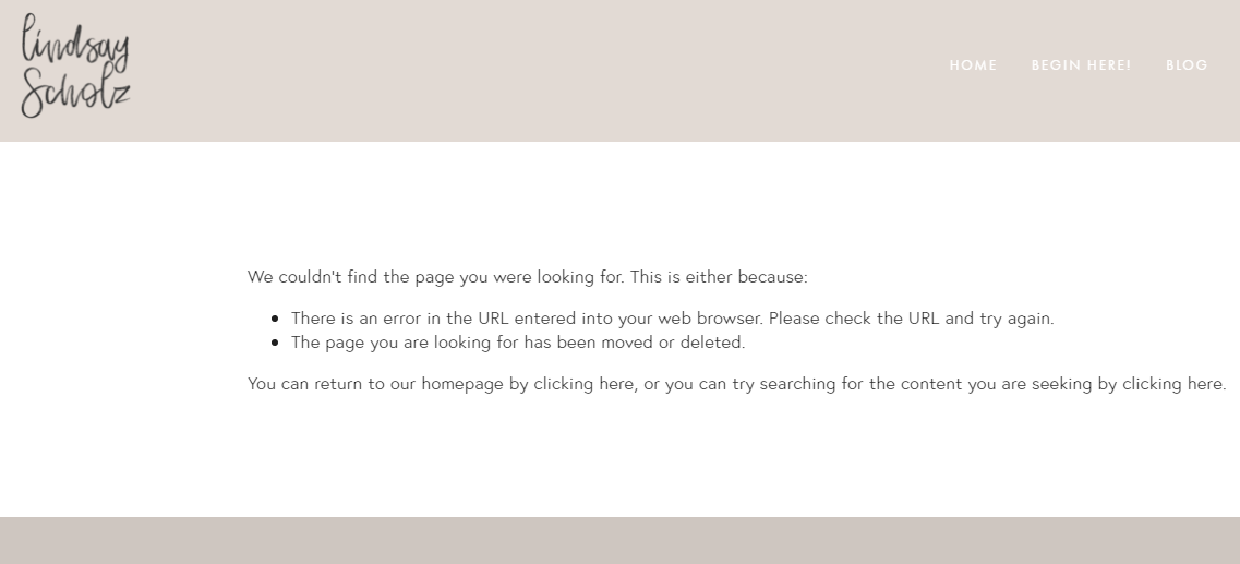
And then I clicked through my most popular, repinned-thousands-of-times pin, and saw THIS:
-audibly screams and stares into laptop in disbelief-
You see, friends, when I converted my old URL (thatworkinggirl.com) to my new one that you’re on today (lindsayscholz.com), I made sure to link to the two but didn’t pay mind to the fact that old pins such as these would be redirecting to a now-dead (RIP!) URL.
I sat there stunned, realizing that I’ve been redirecting potential readers and clients to a dead-end content page for nearly a year. I couldn’t believe it. But then I got over it, and decided to put things into action and whip up a 404 error message page - ASAP.
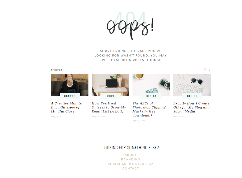
Thankfully, I was able to design and set my 404 error page live in less than an hour, and am now using my error page as an engaging jumping off point for site visitors. I embraced the importance of branding and made the page truly my own:
Don’t have your own customized page live just yet? Fear not! I’m going to walk you through it with three ways that you can turn your 404 error page into an asset today.
1. Keep your apologies light.
404 error pages - although errors! - are an opportunity to let your sense of humor and personality shine. Don’t believe me? Check out some of these brilliantly designed 404 error pages here! Including an “I’m sorry” message will suffice, but also think outside of the box with how you can use this page to creatively communicate your brand values. Just because your link is broken doesn’t mean your spirit should be ;)
2. Have your redirect audience in mind.
Where do the majority of your external links to your website live? For me, the answer is Pinterest. The blog portion of lindsayscholz.com receives the most site traffic, so it’s likely that my redirect visitors are coming onto my site to read more about a blog post.
With that in mind, I included a helpful call-to-action for 404 error visitors to check out the other blog posts that I have living on my site. This approach works in two ways: I’m directing them to alternate content that may still be relevant to them, and I’m increasing the odds of keeping them on my site rather than scaring them away by providing no content of value.
3. Provide more than one jumping off point.
On my 404 error page, I didn’t stop at showing just blog posts - I also included a rundown of helpful links from which readers may benefit. When you look at your site’s analytics, which pages are visited the most? Whether it be your about, services or contact pages, these should be included as an additional jumping off point for visitors to explore your site.
Other examples of jumping off points include a call-to-action to check out a downloadable freebie, a link to your work portfolio, or a simple redirect to your homepage - the possibilities are beautifully endless.
I’m happy to report that within a week of setting my new and improved 404 error page live, I was seeing website traffic up and retained on my site - such a win! Building a custom error page that communicates your brand and gives visitors a reason to stick with you is a must - because broken links happen.
How will you optimize your error page to ensure that you keep your website visitors happy, no matter what? Leave your thoughts in the comments below, and as always, I’m cheering you on!
P.S. - if you’re a Squarespace user like me, they make it super easy to make this happen. You can check out their handy guide for more guidance. If you're stumped as to where to find your 404 error page settings, they live in Settings > Advanced > 404 Error / Page Not Found.


